Cracker Barrel’s 2.5% Sales Slide Ends Julie Masino’s Rebrand Era
A logo change did not sink Cracker Barrel. Treating its most loyal customers like outdated furniture did — and the CEO job was the bill.
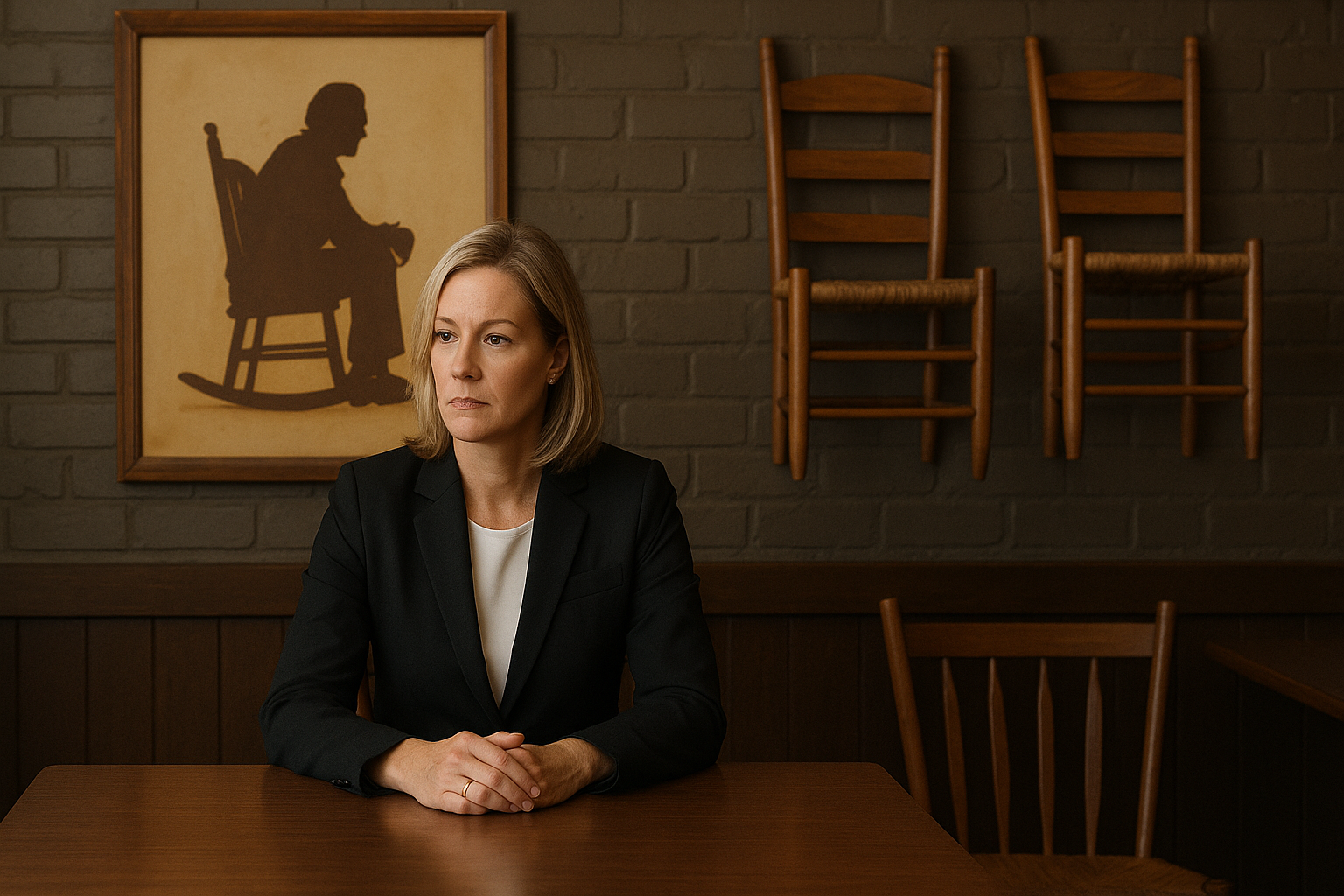
Cracker Barrel did not lose its CEO because somebody hated a logo.
It lost Julie Masino because the company forgot a basic rule of branding: if customers come to you for familiarity, don’t insult them by calling familiarity the problem.
On August 10, David Deno took over as CEO of Cracker Barrel after Masino stepped down from the top job and the board. The formal announcement came on July 27, with Masino remaining as an adviser until October 9. It followed a ghastly period for a business that tried to modernise its image, triggered a political and social-media bonfire, reversed itself, and then reported a 2.5% decline in same-store restaurant sales in the first 11 weeks of its latest fiscal quarter. ([investor.crackerbarrel.com](https://investor.crackerbarrel.com/press-releases))
That is not just a restaurant story. It is a warning label for every founder, marketer and investor who thinks brand strategy is mainly about making an old business look less old.
The core mistake: confusing a brand asset with an aesthetic choice
Cracker Barrel’s attempted refresh in August 2025 removed “Uncle Herschel” — the overalls-clad figure leaning on the barrel in its long-standing Old Timer logo — in favour of a simpler mark: the company name inside a yellow barrel-shaped form.
The company also had plans to modernise restaurant interiors, including removing much of the Americana decor that made the stores instantly recognisable. The response was immediate, ugly and, in plenty of places, hysterical. Critics on the political right labelled it “woke”; Donald Trump joined the pile-on; the share price fell as much as 13% intraday on August 21, 2025. Cracker Barrel then restored the old logo and abandoned the broader modern-layout plan. ([investing.com](https://www.investing.com/news/stock-market-news/cracker-barrel-shares-nosedive-following-storm-over-logo-change-4205786))
Now, let’s be adults about this. Not every angry bloke on social media is a market-research panel. A company cannot let the loudest 500 posts determine every business decision. That is how you end up running a public company by comment section.
But dismissing the response as merely partisan noise would be equally stupid.
The point was not that customers had a sacred relationship with a particular drawing of a bloke near a barrel. The point was that Cracker Barrel had built a commercial promise around a very specific kind of experience: country hospitality, a front porch, rocking chairs, old signs, a retail shop full of bits and pieces, food that feels predictable in the good way.
When you sell comfort, visual continuity is not decoration. It is part of the product.
The logo was the match. The real fuel was the impression that management had decided the thing customers liked was embarrassing and needed sanding down.
That is where the marketing team — and ultimately the CEO — got it badly wrong.
A rebrand cannot fix a value proposition customers no longer believe
Here is the uncomfortable bit for brand people: a modern logo does not create modern relevance.
If your stores are tired, your food proposition is unclear, your service is inconsistent or your prices have drifted beyond what customers think the experience is worth, changing the font is lipstick on a pig. Worse, it signals that management is spending time on the easy, visible job instead of the difficult commercial one.
Cracker Barrel was not attempting a refresh from a position of obvious strength. It was trying to revive demand in a casual-dining market where consumers have been more selective about eating out. Reuters reported that the company’s overhaul was intended to revive the brand, but noted that the social-media storm erased most of the company’s year-to-date share-price gains at the time. ([investing.com](https://www.investing.com/news/stock-market-news/cracker-barrel-shares-nosedive-following-storm-over-logo-change-4205786))
That is why the backlash had such bite. The refresh did not arrive as a joyful evolution of a thriving brand. It arrived as a management-led correction to a business customers already knew was under pressure.
The lesson is brutally simple: you earn permission to change the symbols only after you prove you understand the substance.
If Cracker Barrel had first made the restaurants cleaner, faster and better run while protecting the parts people loved, it might have had room to evolve the presentation later. Instead, the visual change became the whole story. That is a failure of sequencing.
Founders do this all the time. They redesign the website before fixing onboarding. They rename the product before improving retention. They hire a branding agency before calling ten customers who churned.
It feels like progress because there is a deck, a launch date and a nice new typeface. But the customer does not care how handsome your strategy document looks. They care whether the thing they buy got better.
The overlooked angle: the company may have been right that it needed to change
Here is the contrarian view: Cracker Barrel was probably not wrong to believe the business needed renewal.
A heritage brand cannot survive forever by treating nostalgia as a moat. Nostalgia is a rented asset. It works until the people who feel it age out, competitors deliver the same emotional payoff more conveniently, or younger customers decide the brand is not for them.
The problem was not that Masino wanted to modernise. It was that Cracker Barrel appeared to frame modernisation as subtraction: less visual history, less clutter, less of the atmosphere that made it Cracker Barrel.
That is lazy modernisation.
The better version is additive. Keep the distinctive equity, then improve what customers quietly hate: confusing menus, slow payment, dated bathrooms, weak digital ordering, patchy service, poor loyalty economics, bland food photography, irrelevant merchandising. Make the experience easier without making it anonymous.
Look at the difference between renovating a famous pub and gutting it. You can fix the kitchen, improve the lighting, put in decent toilets and add better booking systems. If you rip out the timber, remove the old bar, replace the local character with beige furniture and call it “elevated,” don’t be shocked when regulars decide you have ruined the place.
Cracker Barrel’s new CEO, Deno, comes with serious restaurant credentials. He previously led Bloomin’ Brands and has held senior roles at Yum Brands and Best Buy. The board has not hired a graphic designer. It has hired an operator. That alone tells you what needs fixing now. ([axios.com](https://www.axios.com/2026/07/27/cracker-barrel-ceo-maga-logo))
The second-order implication: brand risk now moves at market speed
Twenty years ago, a rebrand could be unpopular and still settle into the background over a few months. Today, a logo can become a political signal before the brand manager has finished their first media interview.
That does not mean companies should make cowardly decisions. It means brand work now requires better scenario planning.
Before changing a deeply recognisable asset, ask four questions.
First: What exactly are we protecting? Not “the logo” or “the heritage.” Name the emotional job the asset does. In Cracker Barrel’s case, it was reassurance and a particular version of Americana.
Second: What problem does this change solve for customers? If the answer is mostly internal — “we need to look contemporary” — stop. Customers do not pay you for your management team to feel contemporary.
Third: Could the new thing be mistaken for us less easily than the old thing? Distinctiveness matters. A bland identity may be technically cleaner while being commercially weaker because it looks like everyone else.
Fourth: What happens if the worst interpretation wins online? You cannot control every bad-faith actor. You can make sure your change is grounded enough that genuine customers can see the benefit immediately.
Cracker Barrel’s case is a reminder that the market does not separate brand from operations as neatly as boardroom slides do. Customers experienced the logo, the proposed interior changes and the business’s broader struggle as one message: “the company is changing into something else.”
Once that message took hold, reversing the logo could not fully reverse the damage.
What this means for you
If you run a business, do not let your brand team start with the mood board. Start with the receipts.
Pull the last 100 customer complaints, churn notes, bad reviews and lost deals. Sort them into two piles: problems of product and problems of perception. Fix the product pile first. Then use brand to make the improvement legible.
If you are considering a rebrand, write one sentence that a customer would say after seeing it: “This makes my experience better because ____.” If you cannot finish that sentence without corporate gibberish, you are not ready to launch.
Protect your distinctive assets. That could be a name, a colour, a founder’s voice, a ritual, a package shape, a location, a menu item or an annoying little quirk customers secretly love. Do not delete it just because a design presentation makes minimalism look sophisticated.
And test change in the real world before announcing it to the whole internet. Put the new store format in a handful of locations. Run customer interviews with loyalists and lapsed buyers separately. Measure repeat visits, spend, sentiment and operational outcomes. You are not testing whether people clap at a reveal video. You are testing whether they come back and spend money.
The best brands evolve. Of course they do. But they evolve like a great family business: they improve the plumbing, sharpen the offering and make life easier — without demolishing the reason customers walked through the door in the first place.
Cracker Barrel’s 2.5% sales slide is not proof that all change is dangerous. It is proof that changing the wrapper before earning trust on the product is a very expensive way to learn what your brand was worth.